


Creating content for all devices is not only a necessity today, but the best way to future proof your website moving forward. Who is to predict what new ultra cool type of device will come out next? If your website is not responsive, it will likely have problems with those new technologies when they are released. Then you will be playing catch up, trying to get your website to appear legible and true to it's original design.
Responsive design has been around for a while now and every website should be as responsive as possible. Of course, if just one element of your website is not resizing or readjusting position on a per device basis, then you will give a perception that your website is not responsive. A seamless user experience across all devices (phones, tablets, desktops, televisions, gaming consoles) builds trust and keeps visitors engaged. No one wants to zoom in and out just to read your content, and nor should they have to!
Follow these simple guidelines to ensure your website is developed as responsive as possible. It's less costly and easier to fix responsive issues at the start of a new website build than it will be years after you launch.
Follow a Mobile-First Approach
- Designing for mobile first prioritizes usability on the most commonly used devices, ensuring a smooth experience for the majority of members.
- By tackling mobile design first, you can identify and fix potential problems (both design and performance-related) before your site launches.
- Thinking about mobile-first can lead to a more focused design overall, with unnecessary elements being omitted early on.
Implement Responsive Typography
Images on your website scale up/down depending on screen size, so why doesn't your text content scale accordingly as well? Make sure to put in the extra effort during your website development to have fully responsive text. Your page title or headings should not look the same on a 65" television as an iPhone, this not only leads to bad user experience, but also can be an accessibility issue. Don't make your visitors pinch and zoom to rescale your text, automatically adjust it for them!
Beyond readability, responsive text helps elevate the visual appeal of your website and improve user engagement. By scaling text to fit screen size, you avoid the need for excessive scrolling, making your content easier to digest on any device. This approach requires defining multiple breakpoints at different screen sizes to ensure optimal text size for each device. The extra effort during development pays off in a website that's not only functional but also visually pleasing and user-friendly.
Example of using rem values to assign to heading variables:
--tme-fs-heading-h1: 2.25rem; /* 36px */

--tme-fs-heading-h2: 1.75rem; /* 28px */

--tme-fs-heading-h3: 1.375rem; /* 22px */

--tme-fs-heading-h4: 1.125rem; /* 18px */

--tme-fs-heading-h5: 1rem; /* 16px */

--tme-fs-heading-h6: 0.875rem; /* 14px */
Add Necessary Media Queries
While fluid grids and flexible units offer a strong foundation for responsive design, sometimes even the most adaptable layouts need finer control. This is where media queries come in. These powerful CSS tools act like checkpoints, allowing you to target specific screen sizes or device types and apply customized styles for an optimal user experience at each breakpoint. Imagine a breakpoint as a dividing line in screen size. For instance, a narrow smartphone screen might require a completely different layout compared to a large desktop monitor. Media queries empower you to define these breakpoints and adjust styles accordingly.
Example of using media queries to target a specific screen size:
@media (max-width: 991px) { /* Styles for screens less than 991px wide */ }
Common Breakpoints
-
Desktop Breakpoint (979px and above): This range caters to larger screens like desktops and laptops. It's ideal for showcasing complex layouts with multiple columns, as there's ample space to display information without feeling cluttered.
-
Tablet Breakpoint (768px - 959px): This range targets tablets and similar devices. Layouts might need adjustments here compared to desktops. This could involve reducing the number of columns, hiding some elements on smaller screens, or increasing font sizes to ensure readability.
-
Smartphone Breakpoint (below 768px): This range applies to smartphones and other small screen devices. Single-column layouts are most suitable due to limited screen space. Navigation menus might need to be simplified for easier access, and images should be optimized for faster loading times (see SHiNE CMS Image Optimization).
Best Practices
- Design for the smallest screen size first, then progressively enhance for larger devices.
- Determine breakpoints based on content and user needs rather than only specific device dimensions.
- Consider factors such as readability, usability, and content hierarchy when establishing breakpoints.
- Always rigorously test your media queries across a variety of devices and screen sizes to ensure a seamless user experience at each breakpoint.
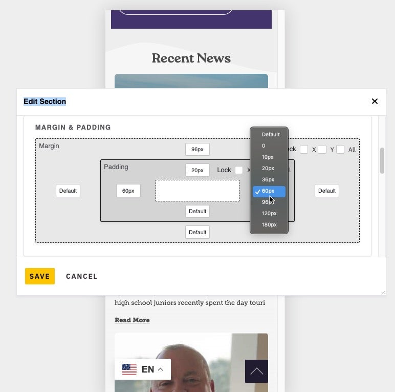
Mobile Device Testing w/ SHiNE CMS
SHiNE CMS offers a new built-in feature for designing from a mobile first approach out of the box! At any time, in just one-click, you can change the view from Desktop to Mobile, to continue making edits to your website and ensure a smooth mobile experience for all your members. Note the selected device is an iPhone 12 Pro, but this can be changed as well to various other mobile devices and screen sizes.
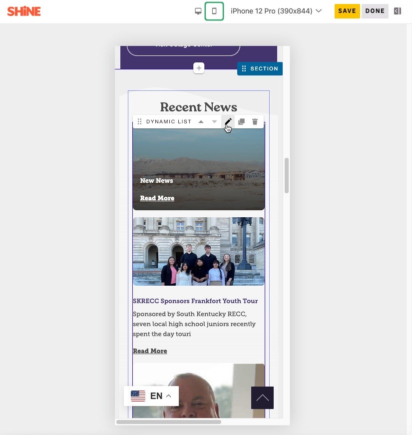
With the addition of our new responsive design interface, you will easily spot when content might need a little more padding, enabling you to have full control over how your website behaves on mobile devices. No need to view source code or know how to change your CSS, these frustrating style changes can all be resolved in just a few clicks, and at any time (before or post launch).
By prioritizing responsive design, you're essentially creating a website that can grow and change with technology, ensuring a positive user experience no matter how people access your content.
Get started with SHiNE CMS to create future proof mobile designs today.
Read more articles
- Log in to post comments
