


Co-op Web Builder team shares several tips to enhance navigation and member experience across your website.
1. Reduce Your Top-Level Navigation Links
While your cooperative website has numerous pages, not all deserve a spot in your primary navigation. Choose the 5-7 most crucial pages to ensure optimal user experience and search engine optimization (SEO) benefits.
Why 5-7 pages?
- SEO: Google prioritizes your homepage. Links from it transfer "authority" to interior pages, but only partially. Fewer navigation links mean more authority flows to each, boosting your SEO.
- User experience: Processing information overload is cognitively demanding. Users tend to skip over menus with more than seven items, potentially missing valuable information.
By focusing on a concise and user-friendly navigation structure, you can improve both SEO and user experience on your cooperative website.
Tip: Instead of linking to pages, you can use non-linkable categories in Co-op Web Builder to organize your menu into columns or sections of member information. See an example of this treatment at Sioux Valley Energy.
Best-in-Class Examples: Crow Wing Power did an amazing job condensing their navigation into digestible sections. Another great example can be see at United Fiber, who boasts a navigation that best organizes services and support offerings.
2. Serial Position Effect
The Power of First and Last Impressions.
Users remember the first and last items in a list best, known as the serial position effect. Leverage this phenomenon in your designs by placing crucial elements at the beginning or end of lists, top or bottom of pages, or far left or right for maximum visibility. Keep lists concise and utilize consistent icon placement for intuitive navigation.
Best-in-Class Example: DEMCO launched a new Co-op Web Builder site (https://demco.org/) with a mega multi-column menu with great organization, following the serial position effect methodology for the top level links.
3. Techniques to Refine Menu Link Options
Crafting the perfect main navigation menu can be daunting, especially for cooperative websites with diverse or extensive amounts of content. To simplify the process, consider reading about these two user-centric techniques and modifying your navigation experience to best support your member experience on your website.
- Path Exploration Report (Google Analytics 4)
The page exploration report is a report that shows you how your users flow through your site, where they get stuck, and where they most commonly go next after visiting a page. Learn how to set this report up for your own website.
- Card Sorting
Card sorting is a powerful tool for shaping website design by revealing how users expect information to be grouped and navigated. By leveraging card sorting, you can ensure your cooperative's website navigation aligns with member expectations and fosters a smooth and efficient user experience. Lean more about card sorting.
Best-in-Class Example: Rappahannock Electric Cooperative conducted in-depth research, including path exploration and member surveys, to optimize the layout of their navigation menu, call to action areas, and key member services.
4. Ensure visitors can reach any page, from any page
Remember, not everyone arrives at your website through the homepage. Therefore, ensure seamless navigation from any page to any other. This means:
- Consistent menu accessibility: Make your menu accessible on every page, with the same design and location across the website for user familiarity.
- Menu completeness: Include all essential pages within the menu for easy access.
- Strategic anchor links: For lengthy content like blog posts or landing pages, implement anchor links strategically placed at the top or throughout the text. These links allow users to jump directly to relevant sections, enhancing their experience and saving them time.
- Breadcrumbs: Allow members to easily go back to a parent page, without interacting with the menu directly. It's a perfect example of offering an alternative method to make navigation easier.
Best-in-Class Example: Setting anchor points on pages is easy with Co-op Web Builder. Check out how Cobb EMC utilizes this navigational strategy to their advantage to enhance member experience.
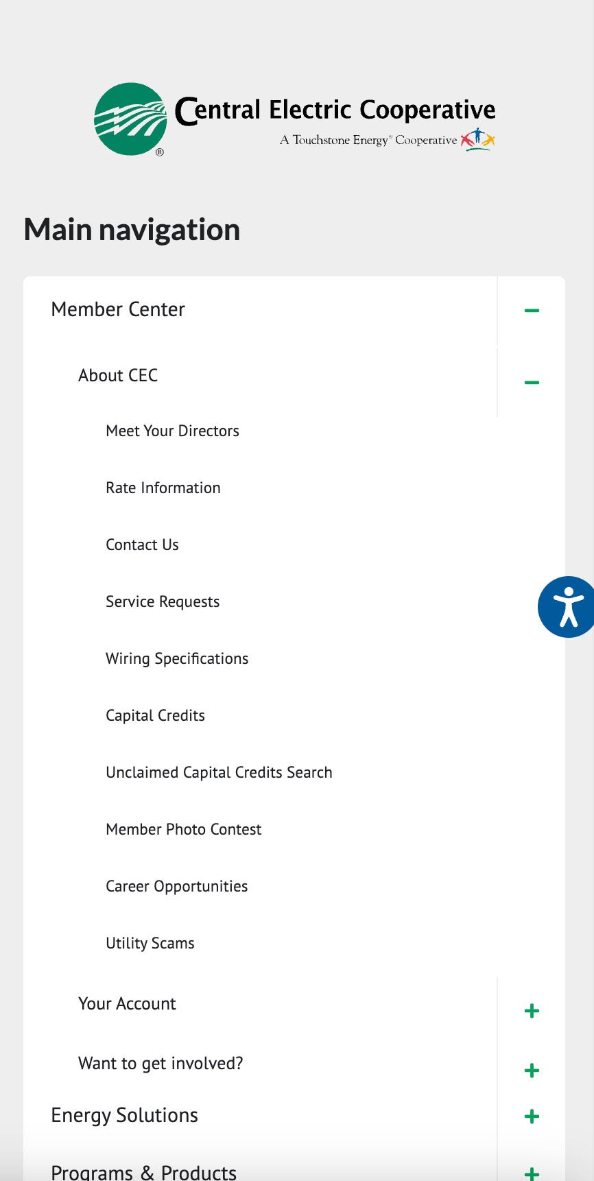
Co-op Web Builder's responsive menu empowered Central Electric Cooperative to deliver a mobile-friendly navigation experience.
By employing larger text sizes for primary links and gradually scaling down for deeper levels, they implemented a best practice that enhances user engagement and information discovery on mobile devices.
Read more articles
- Log in to post comments
